Using JSON Forms
This guide shows you how to implement common patterns and advanced features with JSON Forms in your configuration wizard.
Before you begin, make sure you understand the basics covered in What are JSON Forms?.
Creating layouts
UI elements can be laid out horizontally or vertically, and layouts can be nested to create sophisticated form structures.
Nested layouts
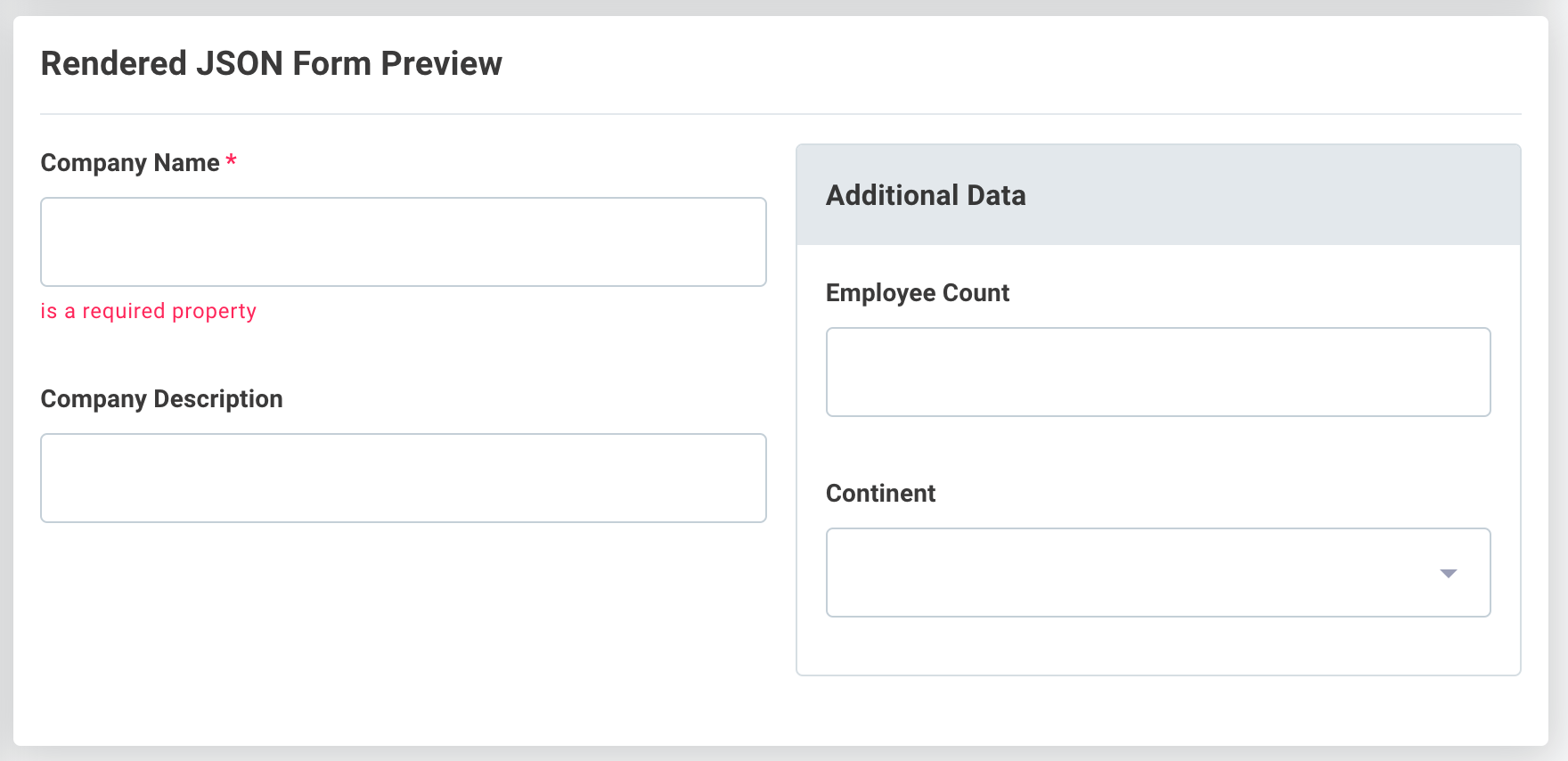
In this example, a HorizontalLayout contains two VerticalLayout elements.
The second vertical layout element is a Group type layout, which adds a container and label around the vertically organized input elements.
{
  "type": "HorizontalLayout",
  "elements": [
    {
      "type": "VerticalLayout",
      "elements": [
        {
          "type": "Control",
          "scope": "#/properties/companyName"
        },
        {
          "type": "Control",
          "scope": "#/properties/companyDescription"
        }
      ]
    },
    {
      "type": "Group",
      "label": "Additional Data",
      "elements": [
        {
          "type": "Control",
          "label": "Employee Count",
          "scope": "#/properties/numEmployees"
        },
        {
          "type": "Control",
          "scope": "#/properties/continent"
        }
      ]
    }
  ]
}
Building dropdown menus
You can present users with dropdown menus of prepopulated options using enum or oneOf properties in your schema.
Using enum for dropdowns
An enum property creates a dropdown menu from a set of string values:
{
  "type": "object",
  "properties": {
    "continent": {
      "type": "string",
      "enum": [
        "North America",
        "South America",
        "Europe",
        "Asia",
        "Africa",
        "Australia"
      ]
    }
  }
}
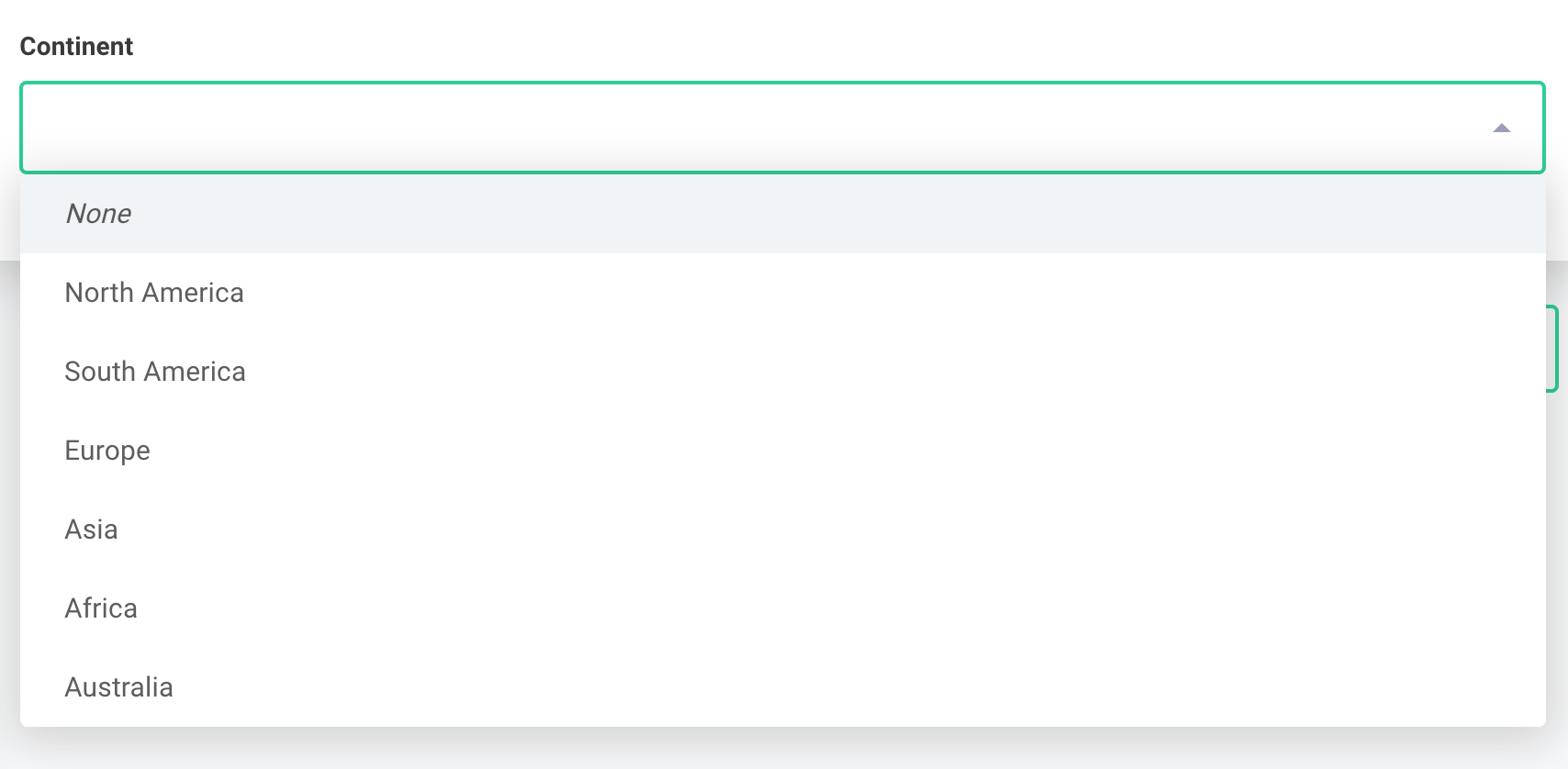
When someone selects "North America", the integration receives { continent: "North America" }.
Using oneOf for custom values
oneOf is useful when you want to show human-readable labels in the UI but return different values to the integration.
In this example, users see full continent names but the integration receives two-letter codes:
{
  "type": "object",
  "properties": {
    "continent": {
      "type": "string",
      "oneOf": [
        {
          "title": "North America",
          "const": "NA"
        },
        {
          "title": "South America",
          "const": "SA"
        },
        {
          "title": "Europe",
          "const": "EU"
        },
        {
          "title": "Asia",
          "const": "AS"
        },
        {
          "title": "Africa",
          "const": "AF"
        },
        {
          "title": "Australia",
          "const": "AU"
        }
      ]
    }
  }
}
When someone selects "North America", the integration receives { continent: "NA" }.
Working with arrays
Arrays allow users to specify values for multiple copies of a set of fields.
In this example, two fields (channel and notifications) are properties of an object that can be repeated within a slackChannels array:
{
  "type": "array",
  "items": {
    "type": "object",
    "properties": {
      "channel": {
        "type": "string"
      },
      "notifications": {
        "type": "string",
        "enum": [
          "Opportunity Created",
          "Opportunity Updated",
          "Opportunity Closed/Won",
          "Opportunity Closed/Lost"
        ]
      }
    }
  }
}
Adding sort buttons
You can enable sort buttons in the uiSchema to let users reorder array elements:
{
  "type": "VerticalLayout",
  "elements": [
    {
      "type": "Control",
      "scope": "#",
      "options": {
        "showSortButtons": true
      }
    }
  ]
}
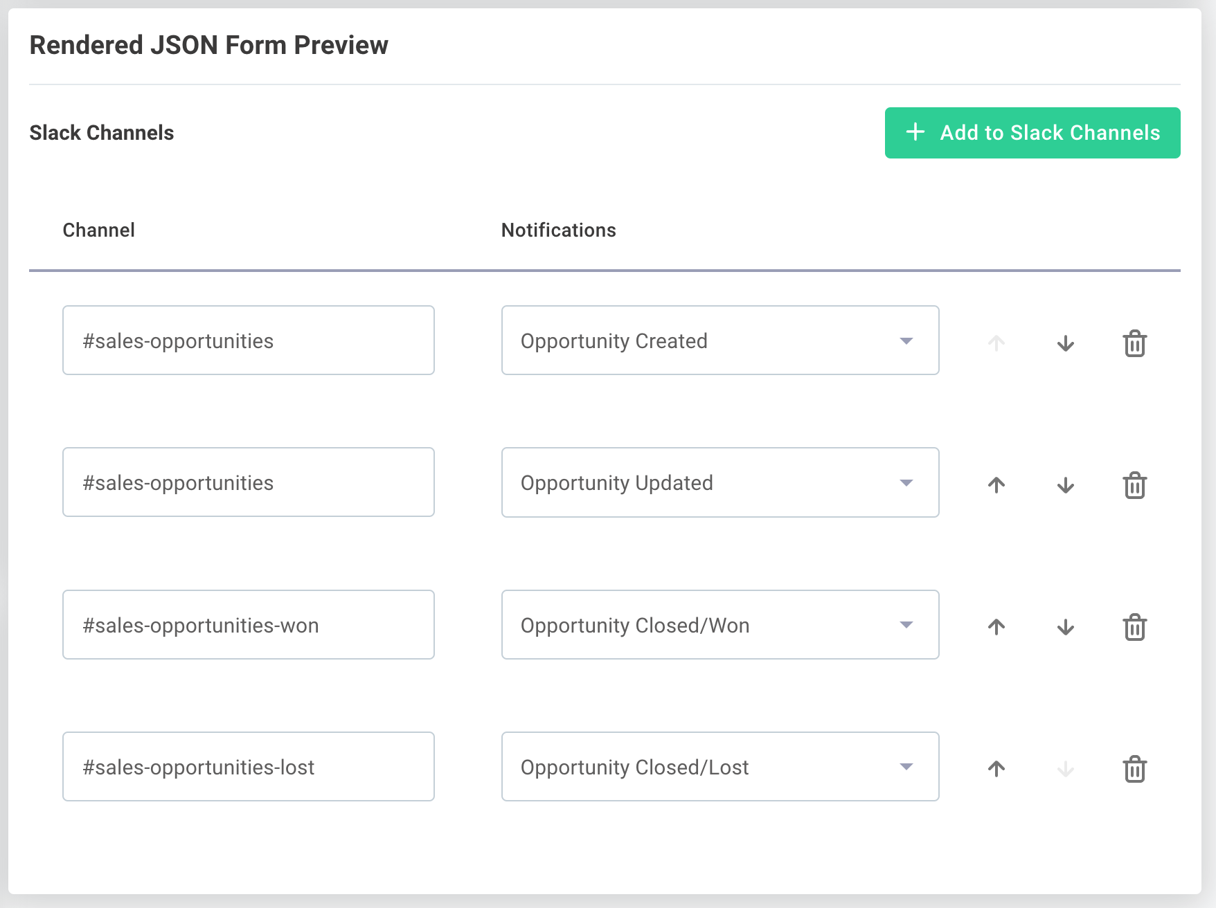
The integration receives arrays as a list of objects:
[
  {
    "channel": "#sales-opportunities",
    "notifications": "Opportunity Created"
  },
  {
    "channel": "#sales-opportunities",
    "notifications": "Opportunity Updated"
  },
  {
    "channel": "#sales-opportunities-won",
    "notifications": "Opportunity Closed/Won"
  },
  {
    "channel": "#sales-opportunities-lost",
    "notifications": "Opportunity Closed/Lost"
  }
]
Using accordion layout for arrays
Arrays can be presented in an Accordion layout to save space in the configuration wizard.
Specify which field should be used for accordion labels with the elementLabelProp option:
{
  "type": "VerticalLayout",
  "elements": [
    {
      "type": "Control",
      "scope": "#",
      "options": {
        "layout": "Accordion",
        "elementLabelProp": "channel",
        "showSortButtons": true
      }
    }
  ]
}

Building field mappers with arrays
Arrays are especially useful when building data mapping UIs. See the Building a Field Mapper Data Source tutorial for a complete example of how to build a field mapper between custom fields in Salesforce and your app.
Showing and hiding fields conditionally
You can show or hide fields based on the value of other fields using UI rules.
A rule contains a condition that determines whether an effect should be applied.
In this example, the convertToUSD input field only appears when the country field is not United States:
{
  "type": "Control",
  "scope": "#/properties/convertToUSD",
  "options": {
    "toggle": true
  },
  "rule": {
    "effect": "SHOW",
    "condition": {
      "scope": "#/properties/country",
      "schema": {
        "not": {
          "const": "United States"
        }
      }
    }
  }
}
For more rule examples, see the JSON Forms rules documentation.
Validating user input
You can validate what users enter into input fields by adding validation properties to your schema.
Common validation properties
format: Built-in formats likeemail,uri,ipv4,date,time,date-timeminimumandmaximum: Numeric range validationminLengthandmaxLength: String length validationpattern: Regular expression pattern matchingformatMinimumandformatMaximum: Date range validation
{
  "type": "object",
  "properties": {
    "stringMinLength": {
      "type": "string",
      "minLength": 5,
      "description": "Please enter a string with at least 5 characters"
    },
    "stringMaxLength": {
      "type": "string",
      "maxLength": 5,
      "description": "Please enter a string with at most 5 characters"
    },
    "email": {
      "type": "string",
      "format": "email",
      "description": "Please enter a valid email address."
    },
    "uri": {
      "type": "string",
      "format": "uri",
      "description": "Please enter a valid URI."
    },
    "ipv4": {
      "type": "string",
      "format": "ipv4",
      "description": "Please enter a valid IPv4 address."
    },
    "regex": {
      "type": "string",
      "pattern": "^(\\([0-9]{3}\\))?[0-9]{3}-[0-9]{4}$",
      "description": "Please enter a valid phone number in the form (123)456-7890."
    },
    "intOneTen": {
      "type": "integer",
      "minimum": 1,
      "maximum": 10,
      "description": "Please enter an integer between 1 and 10."
    },
    "startDate": {
      "type": "string",
      "format": "date",
      "description": "Please enter a date between the first and last day of the current month.",
      "formatMinimum": "2023-08-01",
      "formatMaximum": "2023-08-31"
    }
  },
  "required": [
    "stringMinLength",
    "stringMaxLength",
    "email",
    "uri",
    "ipv4",
    "regex",
    "intOneTen",
    "startDate"
  ]
}
For custom validation rules beyond the built-in options, see JSON Form Validation.
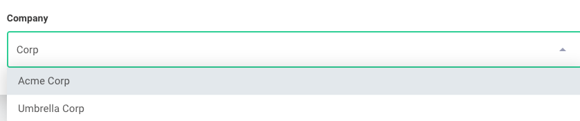
Adding autocomplete to dropdown inputs
You can provide autocomplete functionality for oneOf dropdown menus by enabling the autocomplete option in the uiSchema:
{
  "options": {
    "autocomplete": true
  }
}
In this example, typing "Cor" will match both "Acme Corp" and "Umbrella Corp":
Customizing field mapper layouts
The Building a Field Mapper Data Source tutorial demonstrates a basic field mapper.
You can control the field mapper layout by using a custom options.detail specification.
To create a custom layout:
- Set
options.layoutto"Accordion" - Define your custom layout structure using
options.detail
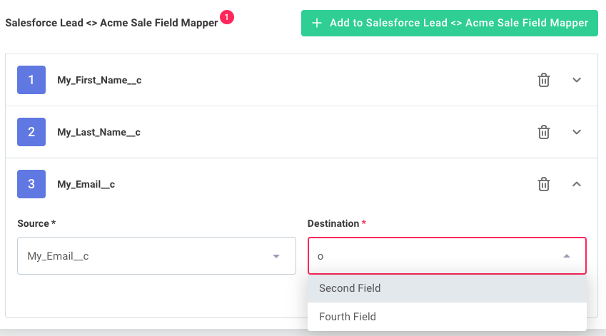
{
  "type": "Control",
  "label": "Salesforce Lead <> Acme Sale Field Mapper",
  "scope": "#",
  "options": {
    "layout": "Accordion",
    "detail": {
      "type": "HorizontalLayout",
      "elements": [
        {
          "type": "Control",
          "scope": "#/properties/source",
          "options": {
            "autocomplete": true
          }
        },
        {
          "type": "Control",
          "scope": "#/properties/destination",
          "options": {
            "autocomplete": true
          }
        }
      ]
    }
  }
}
Creating forms with multiple tabs
JSON Forms can display content across multiple tabs using categorization.
Create tabs with a "type": "Categorization" layout in your uiSchema.
Each category becomes a tab with its own label:
{
  "type": "Categorization",
  "elements": [
    {
      "type": "Category",
      "label": "Contacts",
      "elements": [
        {
          "type": "Control",
          "scope": "#/properties/contacts"
        }
      ]
    },
    {
      "type": "Category",
      "label": "Leads",
      "elements": [
        {
          "type": "Control",
          "scope": "#/properties/leads"
        }
      ]
    },
    {
      "type": "Category",
      "label": "Opportunities",
      "elements": [
        {
          "type": "Control",
          "scope": "#/properties/opportunities"
        }
      ]
    }
  ]
}
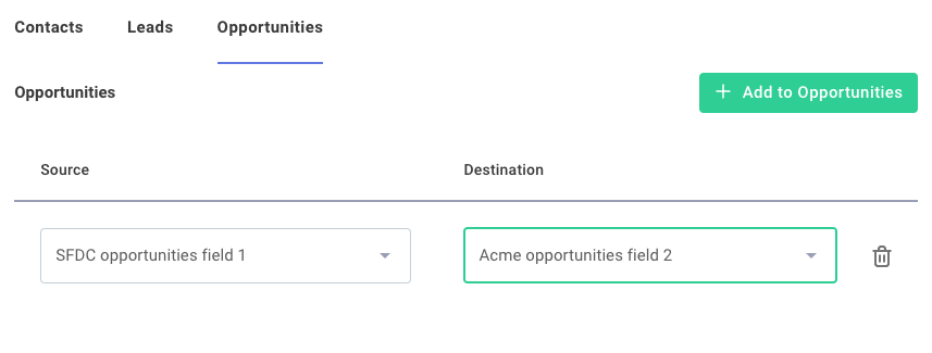
This is particularly useful for complex field mappers that handle multiple object types.
Using JSON Forms in custom components
If your form is static and doesn't depend on fetching data from third-party apps, you can provide schema and uiSchema directly to the JSONForms component.
For forms that need to present dropdown menus or other fields populated from third-party apps, build the form in a custom component using the custom component SDK. See the JSON Forms data sources documentation for details.
Pre-filling forms with default data
Your custom JSON Forms data sources can include a data property in addition to schema and uiSchema.
When you include data, the form is pre-filled with the values you provide.
Handling form data updates
Consider a config wizard with this flow:
- Page 1: Connect to Microsoft SharePoint with OAuth 2.0
- Page 2: Select a SharePoint site from a dropdown menu
- Page 3: Display a JSON form tailored to the selected site, with default data from that site
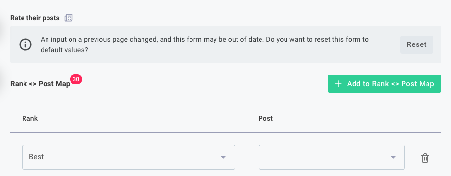
This works fine when a user first completes the wizard. However, if they reopen the config wizard and select a different site on page 2, you need to handle the stale data from their previous selection.
Configuring data source reset behavior
By default, if a config variable has user-supplied data, the default data your config variable generates is ignored in favor of the user's previous selections.
You can override this behavior in the config wizard designer by navigating to Data Source Reset within your JSON Forms config variable:
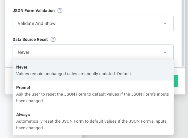
Choose one of these options:
-
Never: Uses the default behavior and displays the user's previous data
-
Prompt: Notifies the end user that their data may be stale and gives them the option to reset the form to the default values supplied by your data source
-
Always: Automatically overrides the user's previous selection with your data source's default
datawhen the data source inputs change
Next steps
You now know how to implement common JSON Forms patterns. Continue learning with these resources:
- Build a complete field mapper: Follow the Building a Field Mapper Data Source tutorial
- Add custom validation: Learn about JSON Form Validation
- Create dynamic forms: See JSON Forms data sources in custom components
- Explore more examples: Try the JSON Forms Playground