Theming Embedded
You can theme your embedded marketplace to match your app's look and feel. To create a custom theme for your embedded marketplace and workflow builder, click your organization's name at the bottom of the left-hand sidebar, then open the Theme tab.
You must have the admin or owner role to edit custom themes.
The left side of the Theme tab displays customizable properties (colors and styles) in 3 separate tabs: Brand, Banner & Log, and Neutral. The neutral tab allows you to choose one neutral color, and additional neutral values used throughout the theme are calculated for you based on your neutral selection. The right side provides a preview of how various UI elements will appear with those custom properties.

Your embedded themes will be applied to your embedded application:

Light and dark mode themes
In the Theme Mode section, you have four options:
-
Light and Dark control the appearance of the Prismatic application when using light or dark mode. Each team member can configure dark or light mode settings from their profile settings page. Alternatively, they can choose to have Prismatic follow their operating system's dark/light mode theme.
Customer themesYour customers will not see Light or Dark themes unless you create customer users for them and they log directly into Prismatic.
-
Embedded Light and Embedded Dark control the theme for your embedded marketplace. These are the themes that your customers will see in the embedded marketplace.
By default, the embedded marketplace automatically switches between dark and light themes based on your customers' operating system settings. This is beneficial if your app also follows OS theme settings. The embedded marketplace will switch between dark and light modes alongside your app.
To override the dark/light mode behavior for embedded and display only either the dark or light theme, add a theme property to your showMarketplace calls:
prismatic.showMarketplace({
  selector: `#my-embedded-div`,
  usePopover: false,
  theme: "LIGHT", // or "DARK"
});
Using a custom font
You can apply a custom font for your embedded marketplace. This is useful if your app uses a custom font and you want to maintain consistency in the embedded marketplace.
Prismatic supports any font available on Google Fonts.
To apply a custom font, add it to prismatic.init() as fontConfiguration.google.families:
prismatic.init({
  fontConfiguration: {
    google: {
      families: ["Inter"],
    },
  },
});
Customizing the loading screen
A loading screen appears briefly when prismatic.showMarketplace() is called.
The screen shows a loading icon on a solid-color background.
You can customize the background color and the color of the loading icon and "Loading" text.
Add a screenConfiguration.initializing argument to do this.
Add it to prismatic.init() to customize colors for all marketplace loading screens.
Or add it to prismatic.configureInstance() or prismatic.showMarketplace() to customize colors for a specific marketplace div.
Colors can be any valid CSS color.
prismatic.init({
  screenConfiguration: {
    initializing: {
      background: "#FF5733",
      color: "blue",
    },
  },
});

// or

prismatic.showMarketplace({
  screenConfiguration: {
    initializing: {
      background: "rgb(5,102,0)",
      color: "rgba(255,153,255,.2)",
    },
  },
});
Renaming "Integration" and "Marketplace"
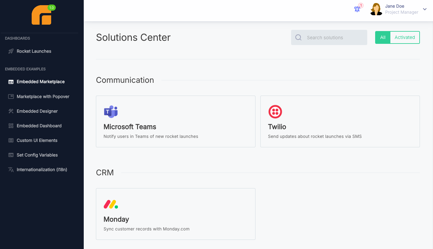
The embedded integration marketplace is labeled "Marketplace" by default and a collection of flows with a config wizard is called an "Integration". You can customize these concepts to match your organization's terminology. For example, your organization might refer to an integration as a "Solution" or a "Workflow".
To modify these terms in the embedded marketplace and workflow builder, navigate to the settings page. Select your organization in the bottom left corner, then choose the Embedded tab.

Your custom terms for "integration" and "marketplace" will be displayed throughout the embedded marketplace and workflow builder interfaces.
For multi-language support, refer to the internationalization settings in the i18n documentation.