Embedding Marketplace
The video above shows how you can embed Prismatic's marketplace in your application. Before embedding marketplace, please review Authenticating Users.
Embed the integration marketplace
You can embed the integration marketplace into your application with minimal code to provide your customers with a native integration deployment experience. This article shows you how to implement Prismatic's integration marketplace in your application.
For information on installing the embedded SDK and authenticating customer users, see Installing Embedded SDK
Once a user has been authenticated, you can display the integration marketplace using the prismatic.showMarketplace() function.
The showMarketplace() function accepts three optional parameters:
usePopover: Determines whether the marketplace should display as a popover. By default, the screen is embedded as an iframe into an existing DOM element.selector: Specifies the DOM element to embed the iframe into whenusePopoveris false.theme: Overrides custom theming default behavior, accepting either"LIGHT"or"DARK"mode.
iframe embedding method
When usePopover is set to false, an iframe HTML element is embedded into the element specified by the selector parameter.
For example, if you have a section of your application that reads:
<div id="integration-marketplace-placeholder" style="height:100%">
  Loading...
</div>
You can embed the integration marketplace iframe into that div, replacing the "Loading..." text, by calling:
prismatic.showMarketplace({
  selector: `#integration-marketplace-placeholder`,
  usePopover: false,
});
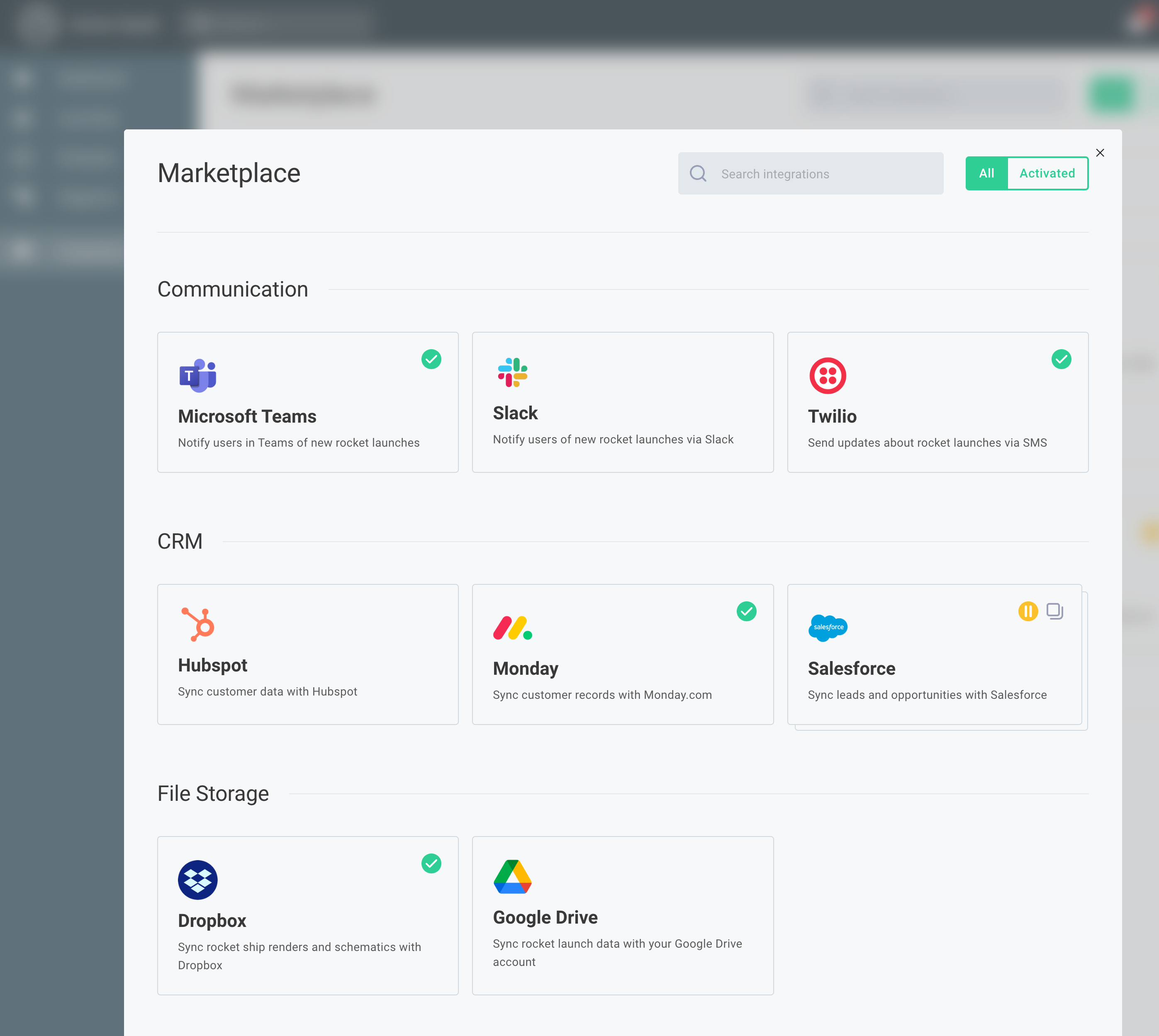
The result is that the integration marketplace appears as part of your application:

At this point, the marketplace has not been themed to match your application. To implement custom branding, see Theming Embedded Marketplace.
For an example of the iframe embedding method, see GitHub.
Popover method
If you set usePopover to true, the integration marketplace will display in a popover:
prismatic.showMarketplace({
  usePopover: true,
});
Filtering integrations
You can filter the displayed integrations by applying filters to your showMarketplace() call.
Simple integration filters
You can filter integrations by a single category or label (or both).
If both filters are applied, integrations must match both category and label to appear.
For example, to show only integrations with the category "ERP" and the label "enterprise" in an embedded marketplace, use:
prismatic.showMarketplace({
  selector: `#my-div-id`,
  usePopover: false,
  filters: {
    marketplace: {
      category: "ERP",
      label: "enterprise",
    },
  },
});
Advanced integration filters
You can use more sophisticated filtering logic using a filterQuery.
You can filter integrations based on their name, labels, or category.
The following operators are available:
-
TermOperator.equal: Returns integrations where the first term equals the second term, works withnameandcategory. Example: To show only the "Dropbox" integration:prismatic.showMarketplace({
filters: {
marketplace: {
filterQuery: [TermOperator.equal, "name", "Dropbox"],
},
},
}); -
TermOperator.notEqual: Returns integrations where the first term does not equal the second term, works withnameandcategory. Example: To show all integrations except those with the category "ERP":prismatic.showMarketplace({
filters: {
marketplace: {
filterQuery: [TermOperator.notEqual, "category", "ERP"],
},
},
}); -
TermOperator.in: Returns integrations whoselabelsinclude a specific label. Example: To show integrations with a "paid" label:prismatic.showMarketplace({
filters: {
marketplace: {
filterQuery: [TermOperator.in, "labels", "paid"],
},
},
}); -
TermOperator.notIn: Returns integrations that do not have specified labels. -
TermOperator.startsWith: Returns integrations with names or categories that begin with a specific string. Example: To show all integrations starting with "Algolia":prismatic.showMarketplace({
filters: {
marketplace: {
filterQuery: [TermOperator.startsWith, "name", "Algolia"],
},
},
});This will match integrations with names like
Algolia - DropboxorAlgolia - SFTP. -
TermOperator.doesNotStartWith: Returns integrations with names or categories that do not start with a specific string. -
TermOperator.endsWith: Returns integrations with names or categories that end with a specific string. -
TermOperator.doesNotEndWith: Returns integrations with names or categories that do not end with a specific string.
You can combine multiple conditions using and and or operators.
For example, to show all integrations that have the category "ERP" and label "paid", plus the Dropbox and Slack integrations:
import prismatic, {
  BooleanOperator,
  TermOperator,
} from "@prismatic-io/embedded";

prismatic.showMarketplace({
  filters: {
    marketplace: {
      filterQuery: [
        BooleanOperator.or,
        [
          BooleanOperator.and,
          [TermOperator.equal, "category", "ERP"],
          [TermOperator.in, "labels", "paid"],
        ],
        [TermOperator.equal, "name", "Dropbox"],
        [TermOperator.equal, "name", "Slack"],
      ],
    },
  },
});
Configure a specific integration
You can use custom UI elements (buttons, divs, hyperlinks, etc.) to start integration deployment.
Call the prismatic.configureInstance() function from your UI element to display a configuration screen for a specific integration.
Provide the integration name as integrationName.
You can include other display parameters (like usePopover and selector) as described in the iframe embedding and popover methods above.
You can also specify an optional skipRedirectOnRemove boolean parameter, which defaults to false.
This determines whether users should be redirected to the integration listview upon removing an integration.
If you're embedding the marketplace, you likely want to keep this value set to false.
If you're implementing a custom API wrapper and handling integration display yourself, you might want to set this to true.
For example, to display the "Salesforce" integration configuration when a button is clicked:
const deploySalesforce = () => {
  prismatic.configureInstance({
    integrationName: "Salesforce",
    skipRedirectOnRemove: false,
    usePopover: true,
  });
};

<Button onClick={deploySalesforce}>Configure Salesforce Integration</Button>;
For an example of implementing a custom marketplace UI and opening the configuration screen for a specific integration with prismatic.configureInstance(), see GitHub.
Listening to marketplace events
The embedded marketplace emits custom JavaScript events when certain things happen:
INSTANCE_CREATED: Emitted when an integration's configuration screen is opened for the first time.INSTANCE_CONFIGURATION_OPENED: Emitted when an instance configuration screen is opened.INSTANCE_CONFIGURATION_LOADED: Emitted when an instance configuration screen has loaded. This is the optimal event to hook into for programmatically setting config variables.INSTANCE_CONFIGURATION_PAGE_LOADED: Emitted when an instance configuration screen transitions between pages.INSTANCE_CONFIGURATION_CLOSED: Emitted when an instance configuration screen is closed (regardless of whether configuration was completed).INSTANCE_DEPLOYED: Emitted when an instance has been configured and enabled for a customer.INSTANCE_DELETED: Emitted when an integration has been deactivated (the instance has been deleted).POPOVER_CLOSED: Emitted when a user closes the popover modal (only applicable whenusePopover: true).
You can subscribe to these events to trigger additional actions in your application when instances are created, configured, deleted, etc.
All events return data in this structure (except for INSTANCE_CONFIGURATION_LOADED, which includes additional data):
{
  "event": "INSTANCE_CONFIGURATION_OPENED",
  "data": {
    "customerId": "Q3VzdG9tZXI6OThiMjU3MDUtZmMzNC00NWYwLTk0ZDItODA0ZjFkYzEyYTZk",
    "customerName": "Smith Rockets",
    "instanceId": "SW5zdGFuY2U6YzJlYTliZjEtY2Y3MS00NTg1LTk2MjMtYjZhNDAxYjQyNWRm",
    "instanceName": "Salesforce",
    "integrationName": "Salesforce",
    "integrationVersionNumber": 18,
    "readOnly": false
  }
}
In this example, we log the customer name and the integration they opened:
import { PrismaticMessageEvent } from "@prismatic-io/embedded";

window.addEventListener("message", (event) => {
  // Check if the message event is of type INSTANCE_CONFIGURATION_OPENED
  if (
    event.data.event === PrismaticMessageEvent.INSTANCE_CONFIGURATION_OPENED
  ) {
    // Extract relevant data
    const { customerName, integrationName } = event.data.data;
    // Log the customer and integration name. Replace this with your desired data handling or helper functions
    console.log(
      `${customerName} opened the configuration page for ${integrationName}`,
    );
  }
});
You can implement similar event listeners for instance configuration page closure, loading, creation, or deletion events.
User-level configuration marketplace events
If user-level configuration is enabled for an integration, the following marketplace events will be emitted:
USER_CONFIGURATION_OPENED: Emitted when a ULC configuration screen is opened.USER_CONFIGURATION_LOADED: Emitted when a ULC configuration screen has loaded. This is the best event to hook into for programmatically setting config variables.USER_CONFIGURATION_PAGE_LOADED: Emitted when a ULC configuration screen transitions between pages.USER_CONFIGURATION_CLOSED: Emitted when a ULC configuration screen is closed (regardless of whether configuration was completed).USER_CONFIGURATION_DEPLOYED: Emitted when a ULC configuration is completed.USER_CONFIGURATION_DELETED: Emitted when a ULC configuration is deleted.
For all of these events, the event's data property will contain:
{
  "event": "USER_CONFIGURATION_LOADED",
  "data": {
    "customerId": "Q3VzdG9tZXI6ZjYxMzY4MzItMzYxYi00NmI3LTlmMmItN2ZkNTc3YzY1YTg1",
    "customerName": "Smith Real Estate",
    "instanceId": "SW5zdGFuY2U6N2I1MjFiNzItYzllNS00YjkwLWIzZGEtZTY4OTY5OWU2ZjBl",
    "instanceName": "Dropbox",
    "integrationName": "Dropbox",
    "integrationVersionNumber": 9,
    "userConfigId": "VXNlckxldmVsQ29uZmlnOjI0NDU5MjA2LWQxNGUtNDRhMy04NWE4LTJjMzgwMzg2Y2NmZg==",
    "userEmail": "2E52B7CB-071B-4EA2-8E9D-F64910EBDBB1",
    "userId": "VXNlcjpmYjc4YzE1OS1kOWMwLTQxMDctYjIyNC0zYmNhMDFlOTQ5NzY=",
    "userLevelConfigVariables": {
      "Dropbox Connection": {
        "status": "ACTIVE"
      }
    },
    "readOnly": false,
    "userName": "Phil Embedmonson"
  }
}
Dynamically setting config variables in marketplace
If you need to programmatically set connection values, consider implementing reusable connections, which enable you to configure connections for each customer. You can also use the embedded SDK to set connection values at deployment time, as demonstrated below.
You can programmatically set values for your customers' config variables by leveraging marketplace events. This is particularly useful when you have access to certain values (API keys, endpoints, etc.) and want to set config variables on behalf of your customers (eliminating the need for them to look up these values).
When your application receives an INSTANCE_CONFIGURATION_LOADED event message (or USER_CONFIGURATION_LOADED for ULC), the message payload includes the properties listed above, plus current config variable values.
You can analyze that event's data and conditionally set values for specific config variables using the prismatic.setConfigVars() function.
Let's examine the event message structure and how to respond with config variable values:
- Event Payload
- NodeJS Example
- React Example
Here's the structure of the INSTANCE_CONFIGURATION_LOADED payload.
The event message's .data.configVars property contains all currently set configuration variables and their values:
{
  "event": "INSTANCE_CONFIGURATION_LOADED",
  "data": {
    "instanceId": "SW5zdGFuY2U6ZTE4NTNkYWItZjJhMi00OGIyLTk1ZWItODRjYzQ3YzRiMzc4",
    "instanceName": "Test Embedded config vars",
    "integrationName": "Test Embedded config vars",
    "integrationVersionNumber": 1,
    "customerId": "Q3VzdG9tZXI6OThiMjU3MDUtZmMzNC00NWYwLTk0ZDItODA0ZjFkYzEyYTZk",
    "customerName": "Smith Rockets",
    "readOnly": false,
    "configVars": {
      "Acme Connection": {
        "inputs": {
          "username": { "value": "" },
          "password": { "value": "" }
        },
        "status": "PENDING"
      },
      "My Key/Value List": {
        "value": [],
        "collectionType": "keyvaluelist",
        "codeLanguage": null,
        "dataType": "string",
        "pickList": null,
        "scheduleType": null,
        "timeZone": null
      },
      "My String": {
        "value": "",
        "collectionType": null,
        "codeLanguage": null,
        "dataType": "string",
        "pickList": null,
        "scheduleType": null,
        "timeZone": null
      },
      "My List": {
        "value": [],
        "collectionType": "valuelist",
        "codeLanguage": null,
        "dataType": "string",
        "pickList": null,
        "scheduleType": null,
        "timeZone": null
      },
      "My String With Default": {
        "value": "Some Default",
        "collectionType": null,
        "codeLanguage": null,
        "dataType": "string",
        "pickList": null,
        "scheduleType": null,
        "timeZone": null
      },
      "My List With Default": {
        "value": ["Foo1", "Foo2"],
        "collectionType": "valuelist",
        "codeLanguage": null,
        "dataType": "string",
        "pickList": null,
        "scheduleType": null,
        "timeZone": null
      },
      "My Picklist": {
        "value": "",
        "collectionType": null,
        "codeLanguage": null,
        "dataType": "picklist",
        "pickList": ["Foo", "Bar", "Baz"],
        "scheduleType": null,
        "timeZone": null
      },
      "My Boolean": {
        "value": false,
        "collectionType": null,
        "codeLanguage": null,
        "dataType": "boolean",
        "pickList": null,
        "scheduleType": null,
        "timeZone": null
      }
    }
  }
}
In this example, we implement a message event listener to monitor for the PrismaticMessageEvent.INSTANCE_CONFIGURATION_LOADED event.
If the event contains a config variable named Acme Connection, we assign a value to that variable.
Additionally, if this is the Salesforce integration, we assign values to some example config variables.
import prismatic, {
  getMessageIframe,
  PrismaticMessageEvent,
} from "@prismatic-io/embedded";

const myListener = (message: MessageEvent) => {
  // Extract event and data information from the message
  const { event, data } = message.data;

  // Verify this is an "INSTANCE_CONFIGURATION_LOADED" event and
  // that the config screen was not opened in read-only mode
  if (
    event === PrismaticMessageEvent.INSTANCE_CONFIGURATION_LOADED &&
    !data.readOnly
  ) {
    // Extract integration name and config variables
    const { integrationName, configVars } = data;

    // Identify the iframe that sent the message for response targeting
    const iframe = getMessageIframe(message);

    // Check if the instance has an "Acme Connection" config variable:
    if (Object.keys(configVars).includes("Acme Connection")) {
      // Verify if they're empty or already populated:
      if (
        configVars["Acme Connection"].inputs.username === "" &&
        configVars["Acme Connection"].inputs.password === "" &&
        configVars["Acme Connection"].status === "PENDING"
      ) {
        // Set username and password fields for "Acme Connection"
        prismatic.setConfigVars({
          iframe, // Target the iframe that sent the message
          configVars: {
            "Acme Connection": {
              inputs: {
                username: { value: "My-User" },
                password: { value: "supersecretpassword" },
              },
            },
          },
        });
      }
    }

    // Set config variables if this is the Salesforce integration
    if (integrationName === "Salesforce") {
      prismatic.setConfigVars({
        iframe,
        configVars: {
          "String Config Var": { value: "Updated Value" }, // Update a simple string
          "String Valuelist": { value: ["Value 1", "Value 2"] }, // Update a value list of strings
          // Update a key-value list
          "String Keyvaluelist": {
            value: [
              { key: "A Key", value: "A Value" },
              { key: "B Key", value: "B Value" },
            ],
          },
        },
      });
    }
  }
};

window.addEventListener("message", myListener);
Here's how to implement a similar JavaScript example using a React useEffect hook:
import React, { useEffect } from "react";
import prismatic, {
  getMessageIframe,
  PrismaticMessageEvent,
} from "@prismatic-io/embedded";

import Loading from "../components/Loading";

const id = "embedded-marketplace-container";

const EmbeddedMarketplace = () => {
  useEffect(() => {
    prismatic.showMarketplace({
      selector: `#${id}`,
      usePopover: false,
      theme: "LIGHT",
    });
  }, []);

  useEffect(() => {
    const listener = (message: MessageEvent) => {
      const { event, data } = message.data;

      if (
        event === PrismaticMessageEvent.INSTANCE_CONFIGURATION_LOADED &&
        !data.readOnly
      ) {
        const iframe = getMessageIframe(message);
        if (data.integrationName === "Test Embedded config vars") {
          prismatic.setConfigVars({
            iframe,
            configVars: {
              "Amazon S3 Connection": {
                inputs: {
                  accessKeyId: { value: "supersecretpassword" },
                  secretAccessKey: { value: "My-User" },
                },
              },
            },
          });
        }
      }
    };
    window.addEventListener("message", listener);
    return () => {
      window.removeEventListener("message", listener);
    };
  }, []);

  return (
    <div id={id} style={{ height: "100%" }}>
      <Loading />
    </div>
  );
};

export default EmbeddedMarketplace;
The getMessageIframe helper function
Your application needs to identify which iframe to send a setConfigVars message to.
Your application might contain multiple iframes, potentially including multiple instances of the embedded marketplace on a single page.
The getMessageIframe function helps identify the iframe that generated the INSTANCE_CONFIGURATION_LOADED event.
If you need to send a setConfigVars message to a specific iframe, you can alternatively provide a selector property to the setConfigVars function (similar to prismatic.showMarketplace()):
prismatic.setConfigVars({
  selector: "#my-marketplace-container",
  configVars: {
    "My Config Var Name": { value: "My config var value" },
  },
});
Hiding UI elements in marketplace
You can optionally hide the Back to Marketplace link, specific tabs from the instance screen, and elements of the instance configuration wizard. This is useful for preventing customers from running tests from the Test tab or reconfiguring alert monitors independently.
To disable specific UI elements, add a screenConfiguration block to your prismatic.showMarketplace() or prismatic.configureInstance() invocations:
prismatic.showMarketplace({
  selector: `#${id}`,
  usePopover: false,
  theme: "LIGHT",
  screenConfiguration: {
    instance: {
      hideBackToMarketplace: true,
      hideTabs: ["Test", "Logs"],
      hidePauseButton: true,
      hideDeactivation: true,
    },
    configurationWizard: {
      hideSidebar: true,
      isInModal: true,
      triggerDetailsConfiguration: "hidden",
      mode: "streamlined", // Hide the initial configuration page
    },
    marketplace: {
      hideSearch: true,
      hideActiveIntegrationsFilter: true,
    },
  },
});
instance.hideBackToMarketplace: Controls whether to hide the Back to Marketplace link in the instance configuration screen (defaults tofalse).instance.hideTabs: Specifies which tabs to hide from the instance configuration screen. Available options are Test, Executions, or Logs tabs. No tabs are hidden by default.instance.hidePauseButton: Controls whether a customer user can pause or unpause an instance.instance.hideDeactivation: Hides the deactivation/remove button on the instance overview screen. This is useful when your application handles instance deletion through its own UI (defaults tofalse).configurationWizard.hideSidebar: Hides the left-hand sidebar from the configuration wizard (config wizard page titles and numbers).configurationWizard.isInModal: Determines whether the config wizard should appear as a modal overlay on the current page. When set totrue, it assumes your embedded marketplace is already in a modal (preventing a modal-in-modal scenario) and opens the config wizard to fill its containing<div>.configurationWizard.triggerDetailsConfiguration: Controls the display of trigger details in the config wizard. Options arehiddento completely hide trigger details,defaultto include the element in collapsed state, ordefault-opento include the element in expanded state. Endpoint details may also be hidden if they are not configured to be Secured by Customer (see Endpoint Configuration).configurationWizard.mode: Can be set totraditionalorstreamlinedand affects the initial configuration page.marketplace.hideSearch: Hides the search bar in the marketplace.marketplace.hideActiveIntegrationsFilter: Hides the top-right filter for active integrations in the marketplace.
To apply these preferences globally (for multiple showMarketplace() and configureInstance() invocations), configure settings in prismatic.init():
prismatic.init({
  screenConfiguration: {
    instance: {
      hideBackToMarketplace: true,
      hideTabs: ["Test", "Monitors"],
    },
  },
});
Screen configuration settings in prismatic.init() can be overridden within specific showMarketplace() or configureInstance() invocations.
Note that hideTabs properties are not merged in this case - the screenConfiguration settings in showMarketplace / configureInstance completely override the default settings in init.
Integration configuration detail screen
The embedded SDK configuration enables fine-tuning of the user experience for accessing the integration configuration details screen. It includes the ability to prevent marketplace users from accessing the detail screen, which is useful if you want to restrict access to the Test, Executions, Monitors, or Logs functionality.
allow-details: Redirects the marketplace user back to the marketplace listing after completing the configuration wizard. When a user selects an integration from the marketplace listing, they see a summary of the integration including its status. Users can manage instances from the overflow menu at the bottom. "View Details" opens the full integration details screen. You can hide specific UI elements on this page. This is the default behavior in SDK version 2.0.0 and later if no configuration is provided.disallow-details: Provides the same experience asallow-detailsbut removes the details option from the overflow menu.always-show-details: Redirects the marketplace user to the full integration details screen after configuration or when selecting an instance from the marketplace listing.
prismatic.showMarketplace({
  selector: `#my-div`,
  screenConfiguration: {
    marketplace: {
      configuration: "allow-details",
    },
  },
});
Configuration wizard customization
When customers configure or reconfigure an integration in your marketplace, they will either see an initial configuration page for editing the instance name and viewing webhook URLs, or they will be taken directly to the first page of the configuration wizard.
This behavior is controlled by the screenConfiguration.configurationWizard.mode option:
traditional: Presents customers with an initial configuration page where they can set the instance name and view general instance details, like flow webhook URLs. This is the default behavior in@prismatic.io/embeddedversions before 3.0.streamlined: Skips the initial configuration page. This is the default in@prismatic.io/embeddedversion 3.x and later.
Note that if you enable multiple instances of your integration to be deployed by a single customer, instance names must be unique. Customers will still see an initial configuration page for editing instance names, but webhook information will not be displayed.
If your config wizard has a single page, the left-hand sidebar displaying config page names will be hidden in streamlined mode.
If you choose streamlined mode but still want to display instance webhook URLs and API keys within your config wizard, you can.
Disabling reusable connections
By default, when a customer configures an integration that includes a customer-activated connection, they can create a new connection or select an existing connection.
You can disable the ability to reuse existing connections by setting the screenConfiguration.configurationWizard.connectionConfiguration option to inline:
prismatic.configureInstance({
  integrationName: "My Integration",
  screenConfiguration: {
    configurationWizard: {
      connectionConfiguration: "inline",
    },
  },
});
Showing all instances in marketplace
Sometimes you may want to deploy an integration to a specific customer via Marketplace without making it generally available to all customers.
To achieve this, deploy an unconfigured instance of the integration to your customer as an organization user.
Then, set the filters.marketplace.includeActiveIntegrations marketplace option to true to display instances that are enabled for a customer (even if the integration is not in the marketplace):
prismatic.showMarketplace({
  selector: `#my-div`,
  filters: {
    marketplace: {
      includeActiveIntegrations: true,
    },
  },
});
includeActiveIntegrations by defaultNote that if you have filters enabled, the includeActiveIntegrations option will not override the filters.
By default, active integrations deployed to a customer must match the specified filters to be displayed.
If you want to display all active integrations regardless of filters, in addition to marketplace integrations that match your filters, set the includeActiveIntegrations option to true and add the strictMatchFilterQuery property set to false.
Multiple instances of one integration in marketplace
By default, customer users can enable a single instance of an integration through the embedded marketplace. However, there are scenarios where you want customers to deploy multiple instances of an integration. For example, your customers might have multiple Shopify stores and require separate instances of your Shopify integration for each store.
Enabling customers to deploy multiple instances of an integration is configured on a per-integration basis. From the marketplace configuration screen or the marketplace drawer in the workflow builder, enable the Allow Multiple Instances toggle.
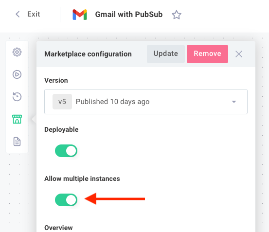
Embedded customer users who select your integration will be able to view existing enabled instances of the integration and will have the option to add additional instances.

Customers will see a similar view if you have enabled multiple instances of an integration for them.
Custom marketplace UI
The embedded marketplace listview screen is presented as an iframe. If you prefer to present marketplace integrations using your own custom UI elements, you can. This is particularly useful if you build some integrations in Prismatic and others outside of Prismatic - you can display both using consistent UI elements.
For complete details, see Custom Marketplace UI.