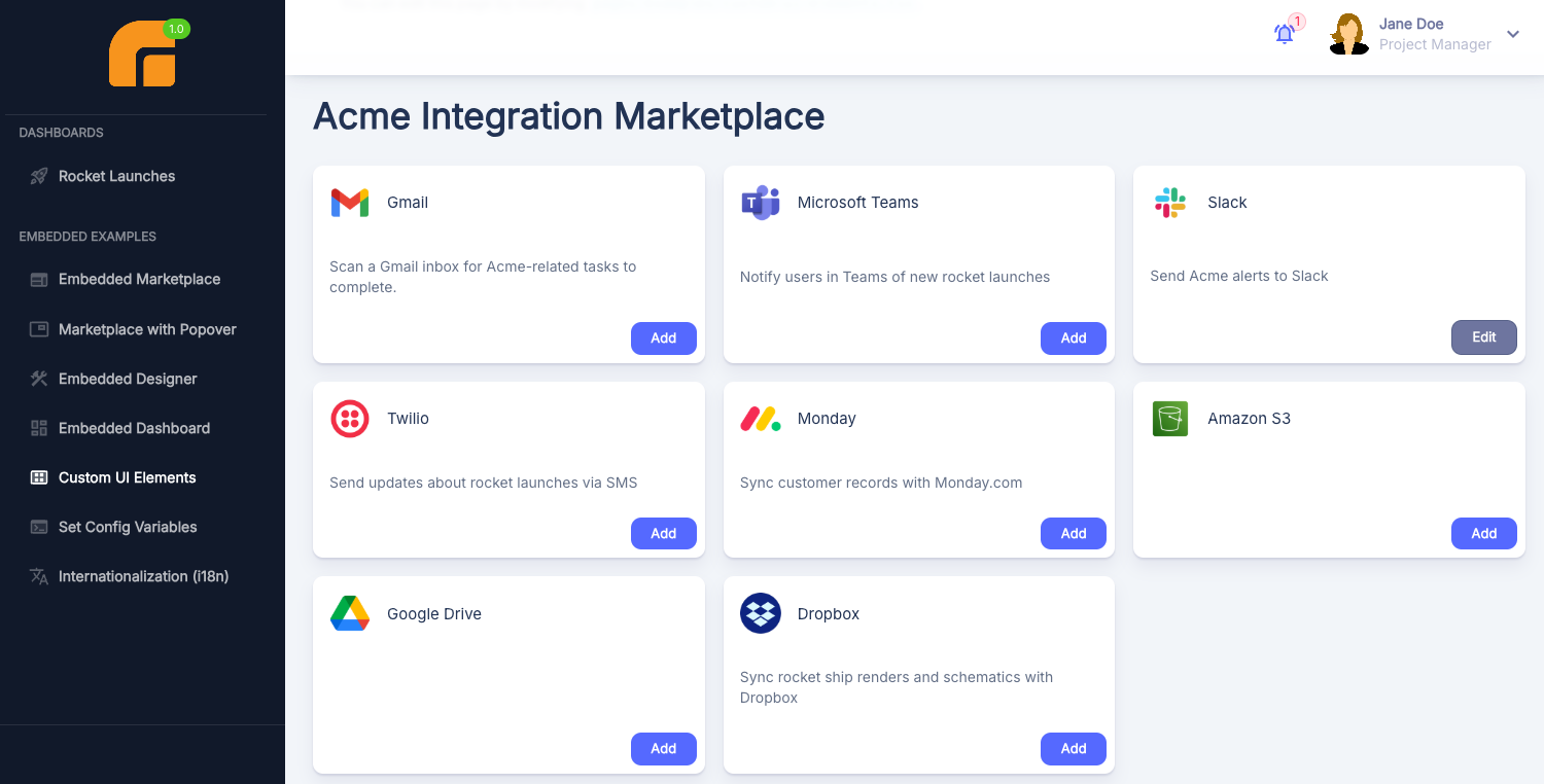
Custom Marketplace UI
Why build a custom marketplace UI?
The embedded marketplace enables you to embed Prismatic's marketplace as an iframe in your application. Theming provides flexibility with the marketplace's appearance and allows you to match your application's branding colors and typography.
But, you may require further customization. With a custom marketplace UI, you can query Prismatic's API for available integrations and map them to native UI elements within your application. You can present integrations as material cards, in a table, as a listview - any format you prefer.
A full example implementation of a custom UI is available on GitHub.
Querying for marketplace integrations
The marketplaceIntegrations) query returns an array of integrations available in the marketplace. Since Prismatic's API is GraphQL-based, you can query for more or fewer fields, but this query (and its corresponding TypeScript types) contains the information needed to display a marketplace:
- GraphQL Query
- TypeScript Types
query getMarketplaceIntegrations {
  marketplaceIntegrations(includeActiveIntegrations: true) {
    nodes {
      id
      name
      allowMultipleMarketplaceInstances
      avatarUrl
      category
      description
      isCustomerDeployable
      marketplaceConfiguration
      overview
      versionNumber
      firstDeployedInstance {
        id
      }
      deployedInstances
      deploymentStatus
    }
  }
}
interface MarketplaceIntegration {
  id: string;
  name: string;
  allowMultipleMarketplaceInstances: boolean;
  avatarUrl?: string;
  category: string;
  description: string;
  isCustomerDeployable: boolean;
  marketplaceConfiguration: string;
  overview: string;
  versionNumber: number;
  firstDeployedInstance?: { id: string };
  deployedInstances: "ZERO" | "ONE" | "MULTIPLE";
  deploymentStatus?: "ACTIVATED" | "PAUSED" | "UNCONFIGURED";
}

type MarketplaceIntegrationsResponse = {
  data: {
    marketplaceIntegrations: {
      nodes: MarketplaceIntegration[];
    };
  };
};
Key points about this query:
- The
includeActiveIntegrationsparameter is optional. Include it if you have customer-specific integrations deployed to only a subset of customers and not added to your marketplace. This displays those integrations to customers who have instances of them. - The
firstDeployedInstance,deployedInstances, anddeploymentStatusproperties are used for performance optimization - they're more efficient than including aninstances { nodes { } }connection in the query.firstDeployedInstancerepresents the first instance of this integration deployed to the customer making the query (if any).deployedInstanceswill have one of three values -"ZERO","ONE"or"MULTIPLE"- representing the number of instances this customer has deployed.deploymentStatuswill have one of four values -"ACTIVATED","PAUSED","UNCONFIGURED"ornull- depending on the state of the instance the customer has deployed (if any).
To execute the query against Prismatic, you can either use the embedded package's prismatic.graphqlRequest function or leverage a GraphQL client like graphql-request.
See Embedded API Requests for more details.
Displaying integration avatars
Each integration returned from the query above has an optional avatarUrl property, which you can use to fetch the icon associated with your integration.
Your avatarUrl will look something like /media/UUID/Integration/UUID/EnumMeta.AVATAR/UUID.png.
With an avatarUrl, make an authenticated API call to Prismatic with your URL as a relative path (e.g. https://app.prismatic.io/media/UUID/Integration/UUID/EnumMeta.AVATAR/UUID.png).
Ensure your request is authenticated with your embedded JWT as a header: Authorization: Bearer ${TOKEN}.
This request will return JSON data in this format:
{ "data": { "url": "https://s3.us-west-2.amazonaws.com/PRESIGNED-URL" } }
You can then set that presigned URL as your image's src property.
Here's an example ReactJS implementation that displays an integration's avatar icon (if available) or defaults to a generic icon if not:
function PrismaticAvatar({ avatarUrl, token }) {
  const [src, setSrc] = React.useState("");

  useEffect(() => {
    let mounted = true;
    if (avatarUrl) {
      // Fetch the presigned URL from
      // https://app.prismatic.io/media/UUID/Integration/UUID/EnumMeta.AVATAR/UUID.png
      fetch(`https://app.prismatic.io${avatarUrl}`, {
        headers: { Authorization: `Bearer ${token}` },
      }).then((response) => {
        response.json().then((data) => {
          if (mounted) {
            setSrc(data.url);
          }
        });
      });
    }

    return () => {
      mounted = false;
    };
  }, []);

  // If the integration has no avatar URL, display a generic avatar icon
  // Otherwise, display an avatar with the presigned URL we fetched
  return src ? (
    <Avatar variant="rounded" src={src} />
  ) : (
    <Avatar>
      <CableTwoTone />
    </Avatar>
  );
}
Opening integration configuration windows
After mapping marketplace integrations to UI elements in your application, you'll want to make them interactive so your customers can open the configuration wizard modal and deploy instances. While you can build the config wizard from scratch and set config variables programmatically, we recommend using Prismatic's implementation of the config wizard. Config wizards are complex!
To open a config wizard, invoke prismatic.configureInstance() with your integration's name (or an existing instance's ID).
See Embedding Marketplace for more details.