Embedding the Customer Dashboard
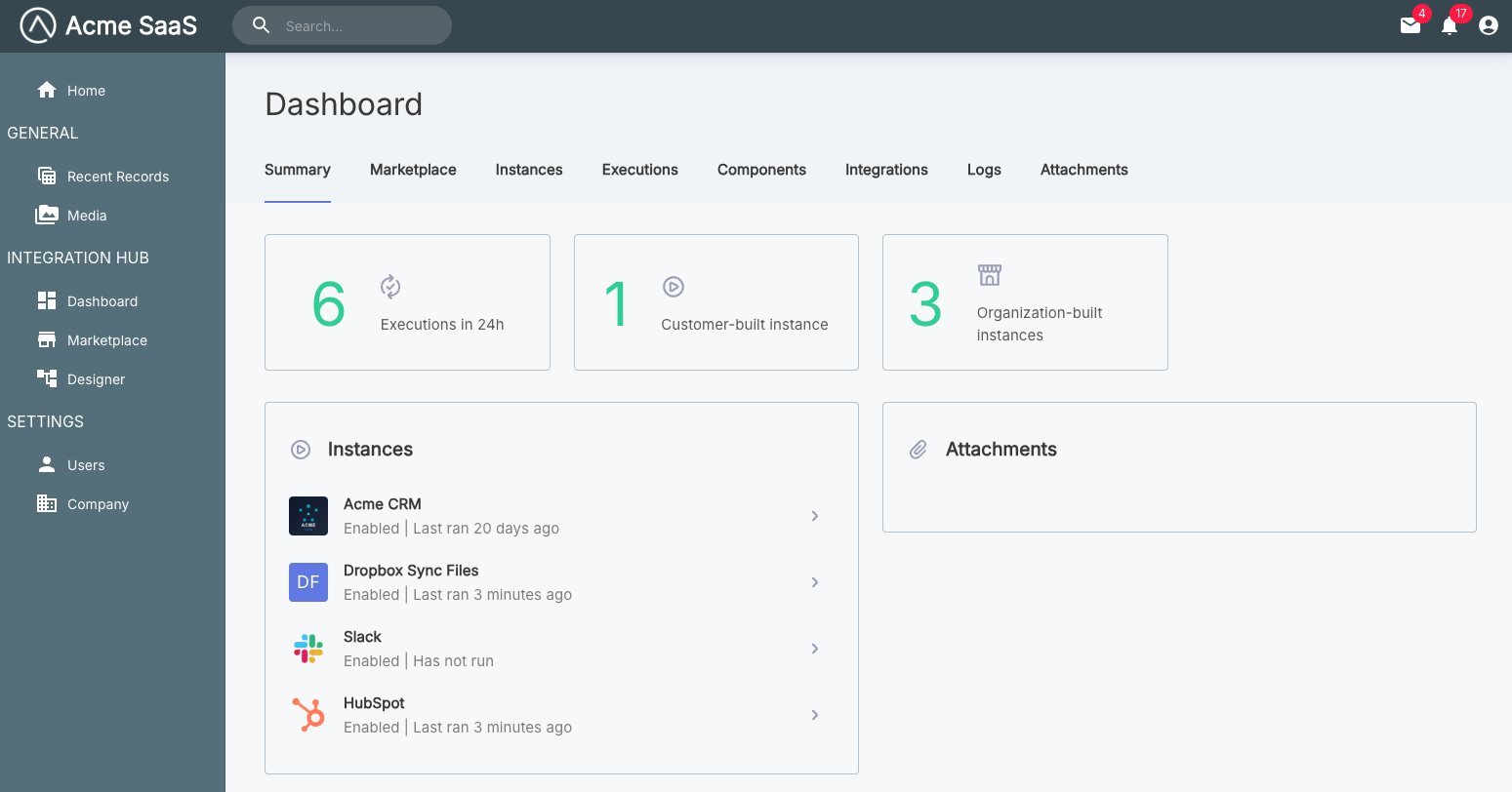
The showDashboard() function embeds the customer dashboard, giving your customers a comprehensive view for managing their integrations, instances, connections, workflows, and monitoring executions and logs.
Basic usage
Showing the customer dashboard
import prismatic from "@prismatic-io/embedded";
import { useEffect } from "react";

const id = "dashboard-div";

function Dashboard() {
  useEffect(() => {
    prismatic.showDashboard({ selector: `#${id}` });
  }, []);

  return <div id={id}>Loading...</div>;
}

export default Dashboard;
Configuration options
The showDashboard() function accepts an optional configuration object. See the Additional Screens Overview for common options like selector, usePopover, theme, autoFocusIframe, filters, and translation.
screenConfiguration
Type: object
Customizes the behavior and appearance of the dashboard screen.
screenConfiguration.dashboard.hideTabs
Type: Array<string>
Hides specific tabs from the customer dashboard. Available tab names include:
"Attachments""Components""Credentials""Executions""Instances""Integrations""Logs""Marketplace"
Hiding tabs in the customer dashboard
prismatic.showDashboard({
  selector: "#dashboard-div",
  theme: "LIGHT",
  screenConfiguration: {
    dashboard: {
      hideTabs: ["Attachments", "Components"],
    },
  },
});
Complete example
Dashboard with full configuration
import prismatic from "@prismatic-io/embedded";
import { useEffect } from "react";

const id = "dashboard-div";

function Dashboard() {
  useEffect(() => {
    prismatic.showDashboard({
      selector: `#${id}`,
      usePopover: false,
      theme: "DARK",
      autoFocusIframe: true,
      screenConfiguration: {
        dashboard: {
          hideTabs: ["Attachments", "Components"],
        },
      },
    });
  }, []);

  return <div id={id}>Loading...</div>;
}

export default Dashboard;