Publishing a Custom Component
Publishing a custom component
Package a component with webpack by running npm run build or yarn build:
$ yarn build
yarn run v1.22.10
$ webpack
asset icon.png 94.2 KiB [compared for emit] [from: assets/icon.png] [copied]
asset index.js 92.2 KiB [emitted] (name: main)
runtime modules 1.04 KiB 5 modules
modules by path ./node_modules/@prismatic-io/spectral/ 49.6 KiB
  modules by path ./node_modules/@prismatic-io/spectral/dist/types/*.js 3.92 KiB 12 modules
  modules by path ./node_modules/@prismatic-io/spectral/dist/*.js 21.4 KiB
    ./node_modules/@prismatic-io/spectral/dist/index.js 4.21 KiB [built] [code generated]
    ./node_modules/@prismatic-io/spectral/dist/util.js 11.9 KiB [built] [code generated]
    ./node_modules/@prismatic-io/spectral/dist/testing.js 5.29 KiB [built] [code generated]
  ./node_modules/@prismatic-io/spectral/node_modules/jest-mock/build/index.js 24.2 KiB [built] [code generated]
modules by path ./node_modules/date-fns/ 16 KiB
  modules by path ./node_modules/date-fns/_lib/ 780 bytes
    ./node_modules/date-fns/_lib/toInteger/index.js 426 bytes [built] [code generated]
    ./node_modules/date-fns/_lib/requiredArgs/index.js 354 bytes [built] [code generated]
  4 modules
./src/index.ts 2.46 KiB [built] [code generated]
./node_modules/valid-url/index.js 3.99 KiB [built] [code generated]
webpack 5.41.1 compiled successfully in 1698 ms
✨  Done in 2.86s.
This will create a dist/ directory containing your compiled JavaScript and icon image.
Now use prism to publish your component.
If you do not have Prismatic's CLI tool, prism, installed, please take a moment to look through the Prism overview page.
$ prism components:publish

Format Name - Format a person's name given a first, middle, and last name
Would you like to publish Format Name? (y/N): y
Successfully submitted Format Name (v6)! The publish should finish processing shortly.
Component versioning
Components are versioned. The first time a component is published it is given version "1". Thereafter, each time the component is republished its version number increments by one.
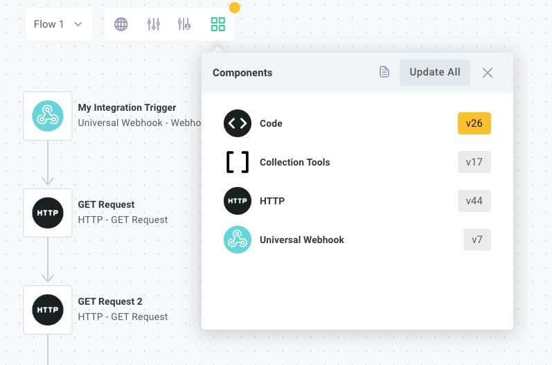
Within the integration designer, you can choose which version of a component to use. Components marked in grey are using the latest version, and components marked with yellow have newer versions available.

In most cases, you'll want to use the latest version of each component. For the sake of stability and consistency, though, versions of components used in integrations are not bumped to the latest version automatically. This prevents unintended issues in your integration if team members publish a broken custom component. You can keep an integration pinned to component "version 6" for example, while your team members experiment with a newer "version 7" of a custom component for another integration.
When your team publishes a new version of a custom component, or when Prismatic publishes a new version of a built-in component, you will see a notification in the integration designer on the Component Versions button indicating that some components are outdated. To upgrade those components, click the Component Versions button and select CHANGE VERSION for the component whose version you want to change.
Publishing components in a CI/CD pipeline
If you have multiple tenants, or if you want to automate the publishing of your custom components, you can incorporate component publishing into your CI/CD pipeline.
At a high level, the steps to publish a component in a CI/CD pipeline are:
- Install the
prismCLI tool - Authenticate the
prismCLI tool with your Prismatic tenant - Build your component
- Use the
prism components:publishcommand to publish your component
If you use GitHub, you can use Prismatic's GitHub Actions to publish your component as part of your GitHub Actions workflow.
This example repo contains an example project structure and GitHub Actions workflow that builds and publishes multiple custom components to Prismatic whenever changes are pushed to the main branch.
Including git commit information
When publishing components in a CI/CD pipeline, you may want to include git commit information with your component publish. This information can help you track which version of your component code is associated with each published component version.
In this example, we derive the commit hash, commit URL, and repository URL from the git repository and include that information when publishing the component:
prism components:publish \
  --comment "Refactored the 'Get Widgets' action"\
  --commitHash $(git rev-parse HEAD) \
  --commitUrl $(git config --get remote.origin.url)/commit/$(git rev-parse HEAD) \
  --repoUrl $(git config --get remote.origin.url)
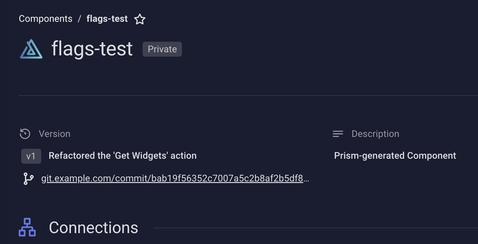
This information is available in the web app when viewing the component's details.

Note: If you use Prismatic's GitHub Actions, the action automatically includes git commit information when publishing your component.